UI/UX Design
Notes from the websites and B2B software I design and build, mostly about prices, timelines and the decisions behind a screen, so you know what to expect before we start.
Success Message UX, and the Screen Most Flows Forget
A booking deserves a page, a step in the middle a banner, and a routine save a changed label. Which success message suits which action, what a confirmation page says, and how screen readers hear it.

Carousel UX, and Why the Next Card Should Peek In
A row of cards which fits the column looks finished, so nobody scrolls it. How much of the next card to show, why rotation works against you, and how this website builds its swipe row.

Dropdown Menu UX for the Mouse, the Finger and the Keyboard
A dropdown menu has three kinds of visitor, one with a mouse, one with a finger and one with a keyboard, and most menus only work for the first. What I built into this site's Capabilities menu, and how to test yours in a few minutes.

Website Button Hierarchy, From 16 Styles Down to Three
Buttons are added one section at a time, so a website mostly collects more button styles than anyone designed. How 16 became three, one for each job, and how the hierarchy is kept in Figma and in the build.

Empty State UX Design for Each Reason a Screen Is Empty
A list can be empty because nothing has been added yet, because the filters match nothing or because the data failed to load. Why each one needs its own words and next step, and how I hand them over in Figma.

Data Table UX Design for B2B Software at 200 Rows
A B2B product earns its keep in its tables. The decisions that make one hold up at 200 rows, from what a row is and how dense it gets to filters, saved views, bulk actions and phones, and how I test them with real data.
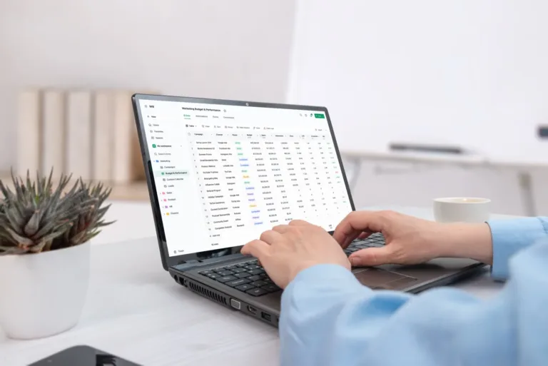
B2B Workflow Design for the Process People Actually Run
The workflow in the requirements doc and the workflow on the floor are different things. How I find the real one, the four things to settle before anyone opens Figma, and why the exception path decides whether the software gets used.

How Long Does MVP Design Take? A Realistic B2B Timeline
Three to five weeks for one workflow, eight to twelve for a multi-role B2B product. Where the weeks go, the four things that stretch them, and what you can safely cut.

What a Dashboard Redesign Costs in 2026
What a dashboard redesign costs in 2026, from one surface to several roles, what pushes a quote up or brings it down, and how to tell whether you need a redesign at all.

What B2B and SaaS Product Design Costs in 2026
Real 2026 ranges for B2B and SaaS product design, why it prices differently from a marketing site, and the parts of a brief that move the number most.

A SaaS Dashboard Redesign, Step by Step
Most dashboard redesigns are restyles, and nobody's day changes. The six steps that make the difference, worked through on an operations dashboard.

Redesigning a Legacy B2B Portal Without Breaking the Workflow
Your users never chose this system and cannot avoid it. Why muscle memory outranks the interface, and how to replace a portal one workflow at a time.
B2B Dashboard Design: 8 UX Principles for SaaS and Internal Tools
Most dashboards are data dumps nobody opens. The eight UX decisions that separate tools people use daily from reports they export to spreadsheets.