Most SaaS dashboard redesigns are restyles. New typeface, softer cards, a chart library with nicer defaults, and six months later the operations team is still exporting to Excel every morning. The screen looks current. Nobody’s day changed.
A redesign that works starts one step earlier, by deciding what the screen is actually for. This is that process on a composite ordering dashboard, drawn from the kind of B2B products I work on rather than any one client’s file, so I can show the reasoning without showing anyone’s data. Six steps, in the order I run them.
The screen we are fixing
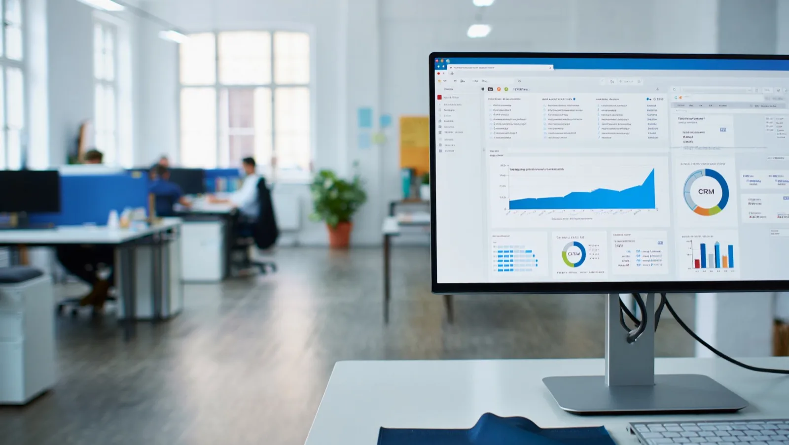
An operations dashboard inside a wholesale ordering platform. Roughly forty daily users, split between operations staff who process orders and two managers who want a view of the week. It carries fourteen widgets: revenue this month, revenue last month, order count, average order value, four charts, a map, a list of recent orders, and three counters nobody could explain to me.
The complaint that starts these projects is never “it looks dated”. It is some version of “people do not use it”. In this case, staff opened the dashboard, glanced at it, and went straight to the orders table by way of the sidebar. The dashboard was a toll gate on the way to the actual product.
Step 1: find the decision the screen exists for
I ask one question of each role: what do you decide with this screen, and how often? Not what they want to see, what they decide. Wants produce widget lists. Decisions produce hierarchy.
Operations answered: whether any order will miss its promised date today. Managers answered: whether this week is tracking behind last week, checked on Monday and forgotten. Two decisions, wildly different frequencies, one screen trying to serve both by giving each half the space.
That is the actual finding. The dashboard was not badly designed, it was undecided. Everything after this step follows from naming those two jobs and admitting that one of them happens forty times a week and the other twice.
Step 2: cut everything nobody acts on
Every widget has to earn its place by connecting to a decision. The audit is blunt:
| Widget | Decision it serves | Verdict |
|---|---|---|
| Orders at risk today | Ops: what do I chase now | Promote to primary |
| Recent orders list | Ops: what just happened | Keep, make it the table |
| Revenue this month | Manager: are we tracking | Keep, demote |
| Revenue vs last month | Same decision, second view | Merge into the above |
| Average order value | None anyone could name | Move to reports |
| Orders by region map | Looks impressive, decides nothing | Cut |
| Three unexplained counters | None | Cut |
Cutting is the part clients resist, so it helps to reframe it: nothing is deleted, it moves to a reports section where the two people who occasionally want it can find it. What leaves the dashboard is not the data, it is the claim on attention.
Step 3: make the healthy state boring
The old dashboard treated every number identically: same card, same weight, same colour. When everything shouts, the screen carries no signal, and the eye learns to skip it.
So the redesign inverts it. On a normal day the screen is calm and mostly grey, with one line at the top reading that nothing needs attention. When three orders are at risk, that line becomes the loudest thing on the page and names them. Exception gets the emphasis; the healthy state gets deliberate silence.
This is the single change that most affects whether a dashboard gets opened, and it is nearly free to implement. It is principle two of the eight I keep returning to.

Step 4: fix the table, because the table is the product
Once the widgets are cut, what remains is a table, and B2B products live or die in tables. The changes that pay back daily:
- Right-aligned numbers with consistent decimals, so columns scan vertically instead of zig-zagging.
- Tabular figures, so digits occupy equal width and the eye can compare rows without reading them.
- A density toggle. Comfortable for browsing, compact for the person who wants forty rows in view at once. Power users always pick compact, and they are the ones here all day.
- Saved views instead of re-filtering. If someone applies the same three filters every morning, that is a view, and it should survive a logout.
- Bulk actions on selection, because the real task is rarely one row. It is fourteen rows that all need the same thing.
- The status column doing real work, with a small set of states that map to what staff actually say out loud, not to the database enum.
None of this photographs well. All of it is what people mean when they say a tool feels fast.
Step 5: design the states nobody asks for
Briefs describe the happy path. Production is mostly everything else, and this is where a redesign either holds up or falls apart in month two.
For each screen I design the empty state (new account, no orders yet, and it should teach rather than apologise), the error state (the data did not load, and the difference between “we are retrying” and “this is stale from 9am” matters operationally), the partial state (three of five integrations responded), and the overload state, which for a dashboard means what happens at forty orders at risk rather than three. A list that works at three and collapses at forty is a design that only works on a good day.
Step 6: decide how you will know it worked
Agree the measure before launch, because afterwards everyone reaches for whatever number flatters the project. For an operations dashboard the honest ones are:
- Time to the first action after opening the screen. If the dashboard is doing its job, this falls.
- Exports to spreadsheet. Every export is the product failing to answer something. This is the metric clients find most uncomfortable and most useful.
- Proportion of sessions that touch the dashboard at all rather than routing straight past it.
- Orders that miss their promised date, which is the business outcome the whole screen exists to protect.
Capture all four for a few weeks before you change anything. A redesign without a baseline cannot be defended later, and on internal tools someone always asks.
What this costs and how long it takes
One dashboard surface, taken through these six steps, is usually three to five weeks of design and lands between $3,000 and $8,000 as a defined piece of work, more if the build is included. The variable is not the design time, it is how quickly you can get me in front of the people who use the screen, which is the same constraint I described in rebuilding a legacy portal. Full rate context sits in hiring a B2B designer in the Philippines.
Frequently asked questions
How do I know if our dashboard needs a redesign or a rebuild?
If people open it and act, it needs tuning. If people route around it to the underlying table, the screen has the wrong job and needs re-deciding, which is a redesign. If the data itself is wrong or late, no amount of design fixes it and you have an engineering problem wearing a design costume.
Our stakeholders want every metric on the dashboard. What do I do?
Ask each requester what they would do differently if the number moved. Metrics with no answer go to a reports page, which satisfies the request without spending the attention budget. This reframes the conversation from removal to relocation, and almost nobody objects to relocation.
Should the dashboard be role-specific?
Usually yes, and it is cheaper than it sounds. Two roles with genuinely different decisions need different default views, not two separate products. Same components, different arrangement and defaults.
How much does a SaaS dashboard redesign cost?
For a single surface, $3,000 to $8,000 of design work in 2026, three to five weeks. A multi-role product with several dashboards runs $10,000 to $30,000. Adding the front-end build adds roughly 40 to 60 percent and removes the handoff entirely.
Can we do this without talking to users?
You can, and the result will be a nicer-looking version of the same undecided screen. The whole value of step one is that it cannot be answered from inside a meeting room. Two hours of watching someone work is the cheapest input in the project.
If your dashboard is being ignored
The pattern is consistent enough that I can usually tell within a call whether the problem is hierarchy, data, or an undecided job. This is the work I do as dashboard design. If you want a second opinion on which one you have, send me a screenshot and tell me who uses it and for what. More of this kind of work is in my case studies.
Planning a website or product design project?