All projects

Ampersand

Fintech Website Brand Identity Concept
Role Design
Platform Figma
Year 2026
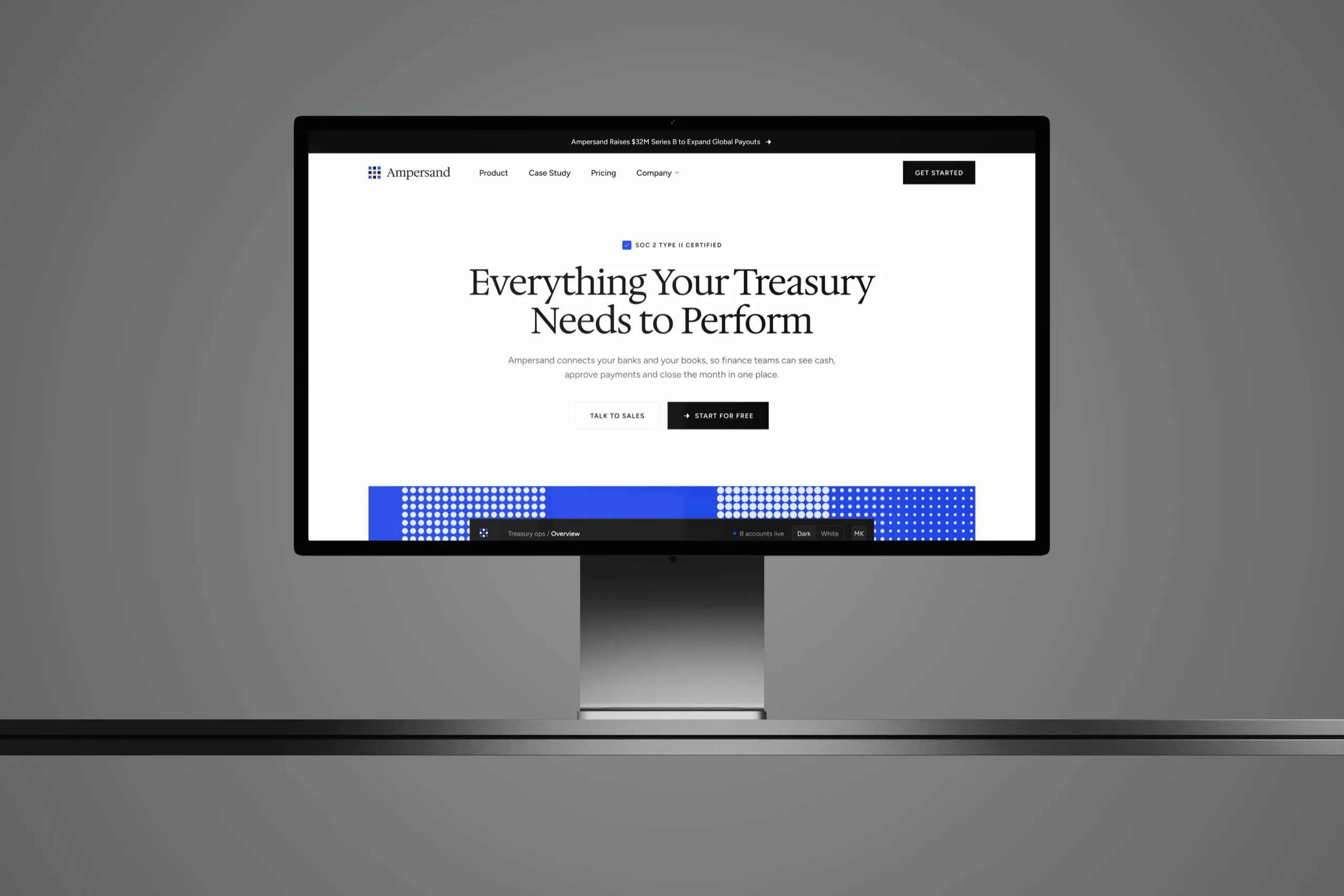
The Ampersand homepage, Everything Your Treasury Needs to Perform, on a Studio Display against a grey wall
Overview

A treasury brand that earns trust before the first demo.

I took on the fintech website design for Ampersand end to end, from the brand and a token-based design system to eight pages at desktop and phone sizes, so every section puts a working screen in front of a finance team before it asks for a demo.

Problem

Treasury software sounds the same everywhere.

Finance teams compare a dozen platforms that promise visibility and control, and most of their websites hide the product behind stock photos, vague claims and a demo form.

Solution

Let the product make the case.

Every section sets a real screen beside its claim, a live cash position, a payment run waiting for approval and a reconciliation that matches itself, in a quiet serif brand with one blue and a halftone texture.

Design process

  1. 01

    Discovery

    Reference study Section Library review
    Headline font scan Low-key photo direction
  2. 02

    Structure

    Eight-page sitemap Section rhythm rules
    Two photos per page Footer call to action
  3. 03

    Design

    Hedvig serif brand Tokens with phone modes
    Halftone generator Pixel icon set
  4. 04

    Handoff

    Components page Documented style guide
    Desktop and phone specs Elementor build
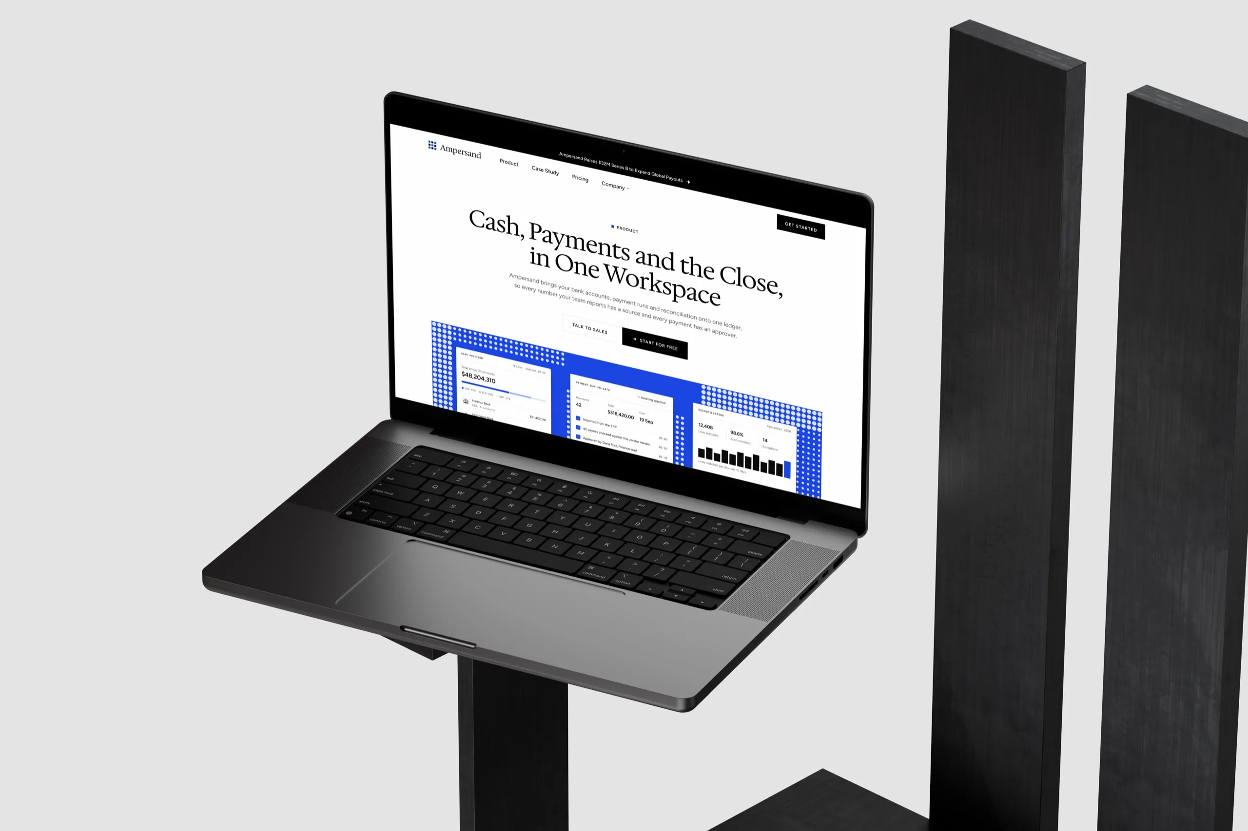
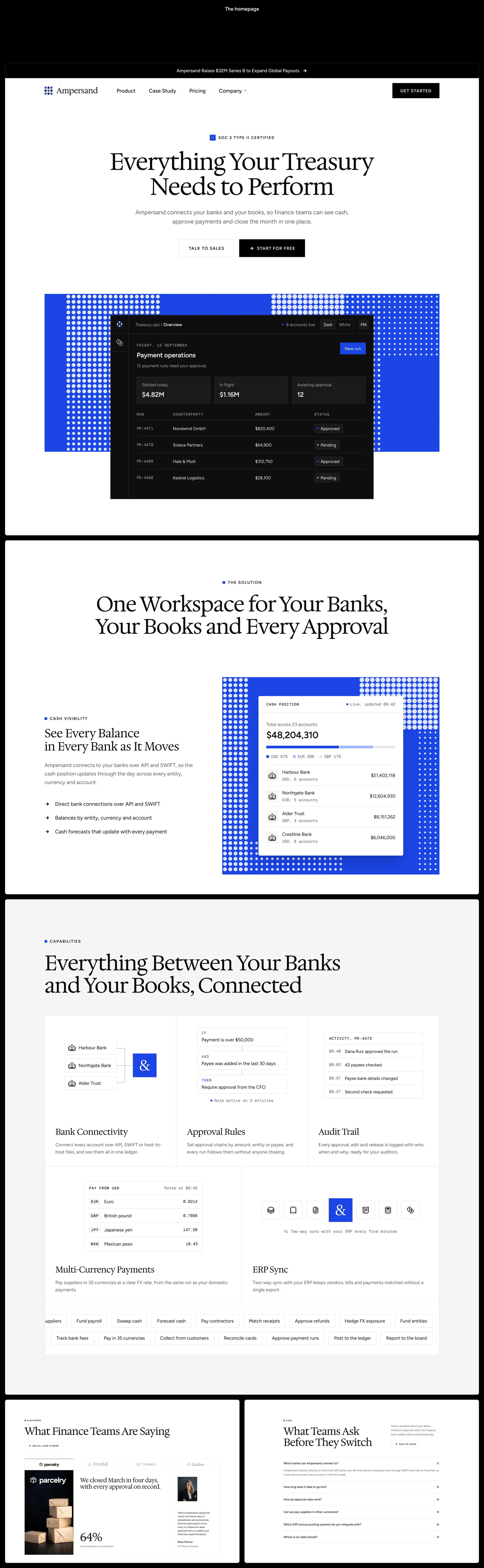
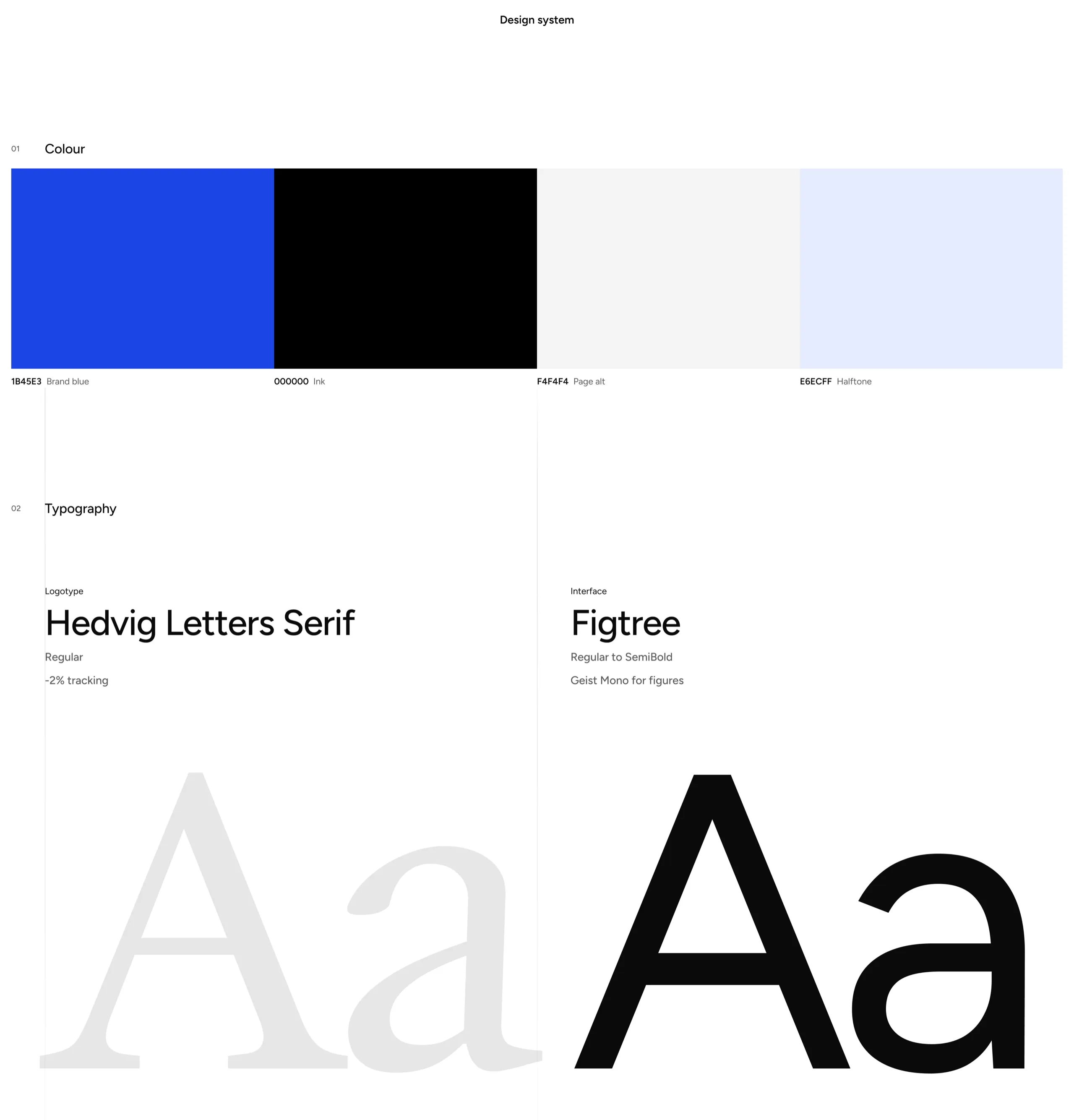
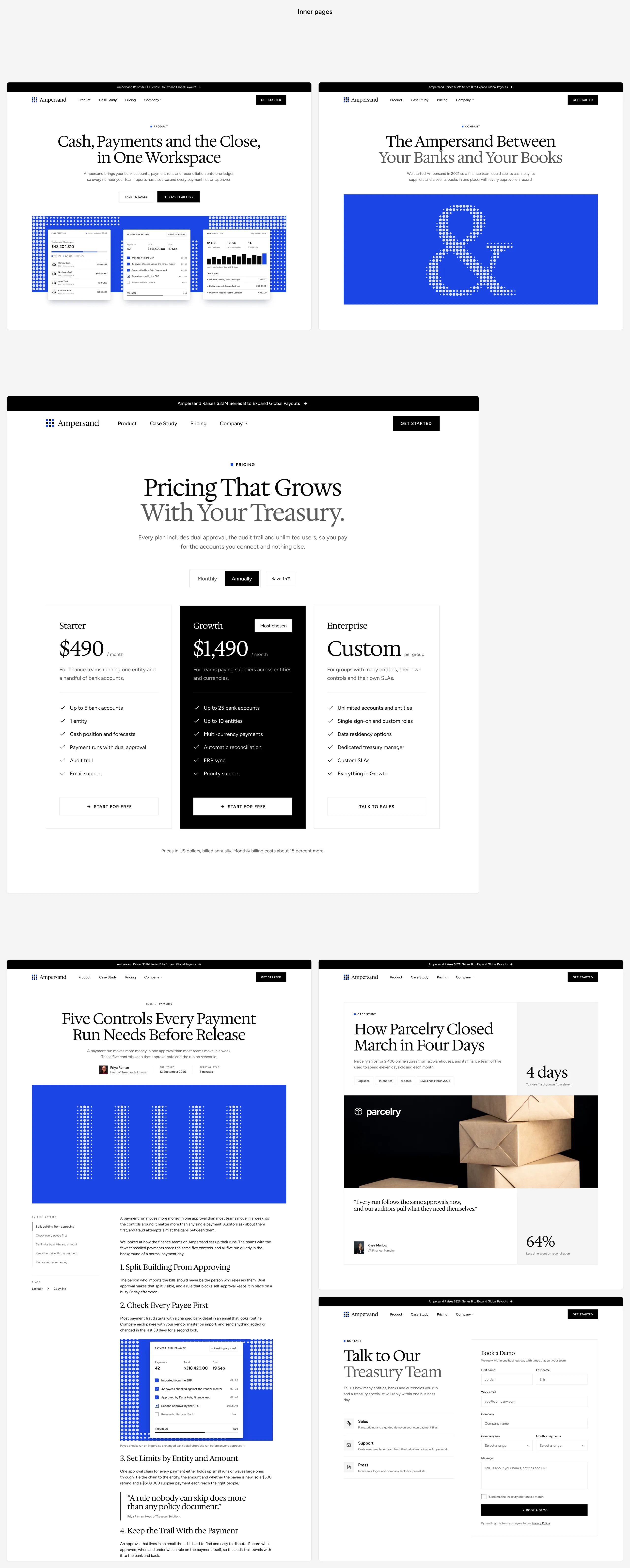
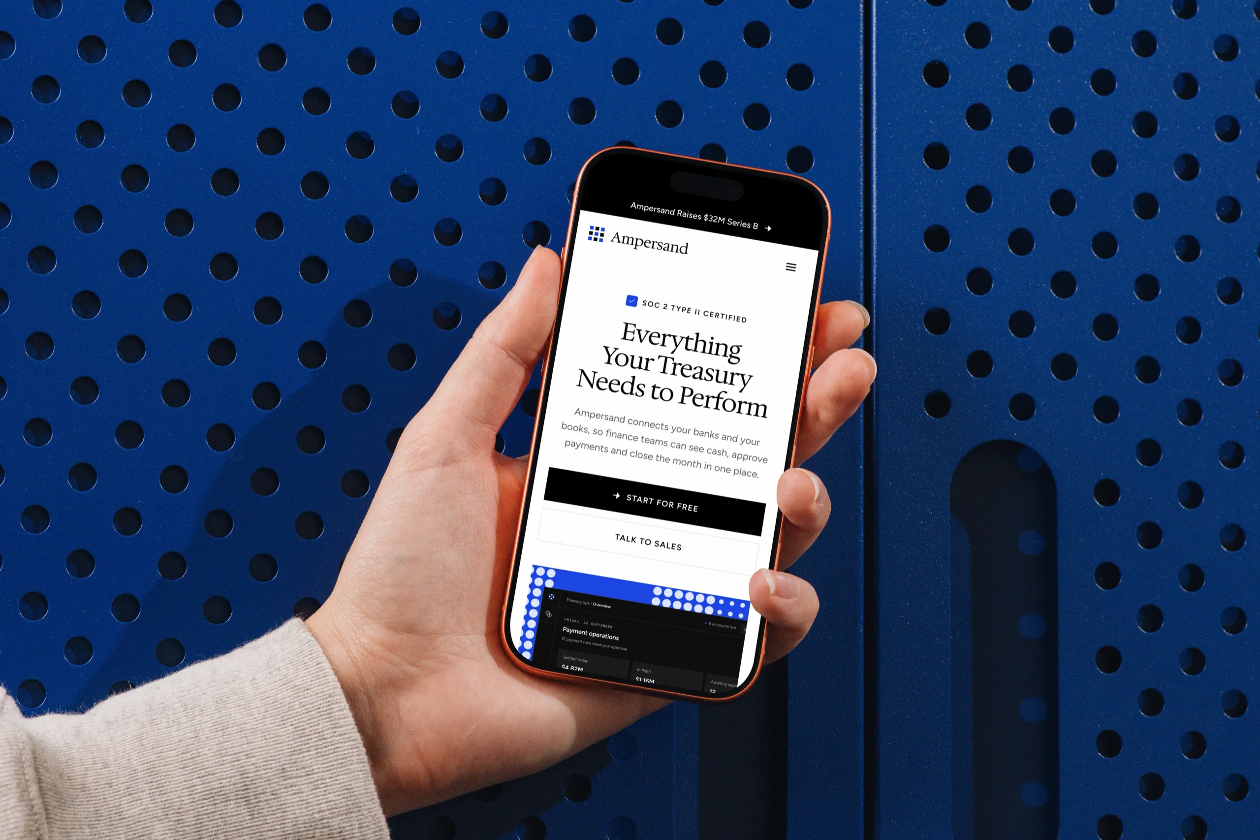
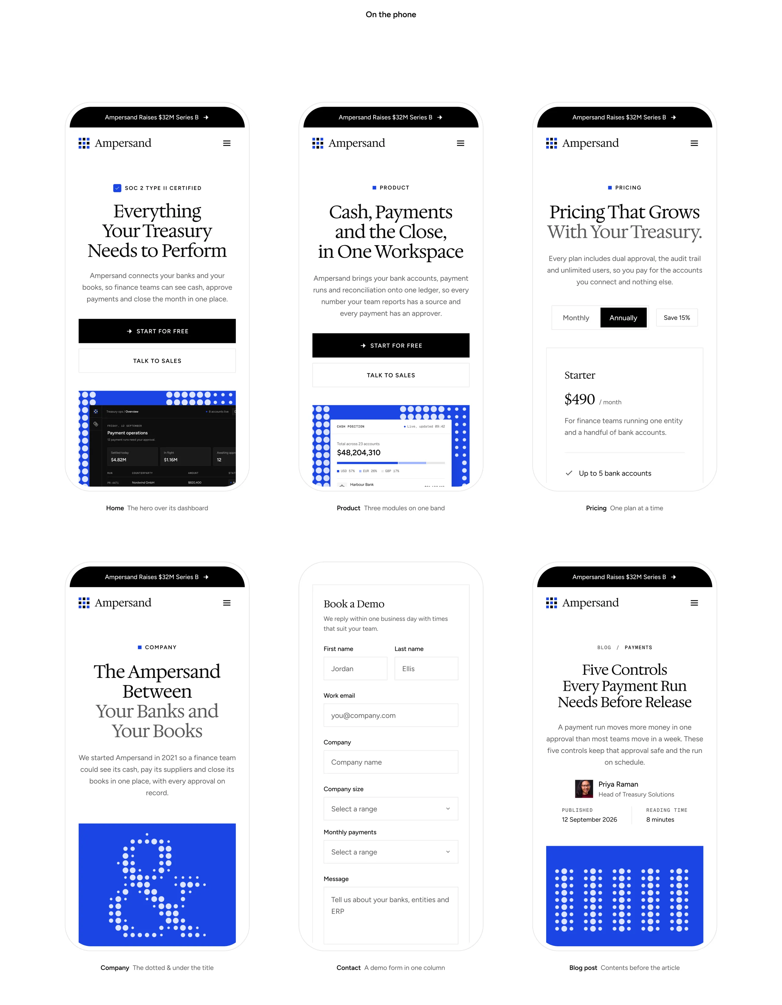
The Ampersand product page, Cash, Payments and the Close in One Workspace, on a MacBook Pro on a black stand The Ampersand fintech homepage in full, from the hero and its payment operations dashboard through the solution and the capabilities to customer stories and the FAQs The Ampersand design system, with brand blue, ink, page alt and halftone colours, Hedvig Letters Serif for the logotype and Figtree for the interface Ampersand inner pages, with the product and company pages, pricing with three plans, a blog post, the Parcelry case study and the contact page The Ampersand homepage on an iPhone held in one hand against a blue perforated cabinet Ampersand on the phone, with the home, product, pricing, company, contact and blog post pages An empty meeting room at night, closing the case study with Mike's contact email

Let's collaborate

Mike Lopez © 2026 designed & developed by Mike LopezPrivacy notice GMT+8
All projects

Ampersand

Fintech Website Brand Identity Concept
Role Design
Platform Figma
Year 2026
The Ampersand homepage, Everything Your Treasury Needs to Perform, on a Studio Display against a grey wall
Overview

A treasury brand that earns trust before the first demo.

I took on the fintech website design for Ampersand end to end, from the brand and a token-based design system to eight pages at desktop and phone sizes, so every section puts a working screen in front of a finance team before it asks for a demo.

Problem

Treasury software sounds the same everywhere.

Finance teams compare a dozen platforms that promise visibility and control, and most of their websites hide the product behind stock photos, vague claims and a demo form.

Solution

Let the product make the case.

Every section sets a real screen beside its claim, a live cash position, a payment run waiting for approval and a reconciliation that matches itself, in a quiet serif brand with one blue and a halftone texture.

Design process

  1. 01

    Discovery

    • Reference study
    • Section Library review
    • Headline font scan
    • Low-key photo direction
  2. 02

    Structure

    • Eight-page sitemap
    • Section rhythm rules
    • Two photos per page
    • Footer call to action
  3. 03

    Design

    • Hedvig serif brand
    • Tokens with phone modes
    • Halftone generator
    • Pixel icon set
  4. 04

    Handoff

    • Components page
    • Documented style guide
    • Desktop and phone specs
    • Elementor build
The Ampersand product page, Cash, Payments and the Close in One Workspace, on a MacBook Pro on a black stand The Ampersand fintech homepage in full, from the hero and its payment operations dashboard through the solution and the capabilities to customer stories and the FAQs The Ampersand design system, with brand blue, ink, page alt and halftone colours, Hedvig Letters Serif for the logotype and Figtree for the interface Ampersand inner pages, with the product and company pages, pricing with three plans, a blog post, the Parcelry case study and the contact page The Ampersand homepage on an iPhone held in one hand against a blue perforated cabinet Ampersand on the phone, with the home, product, pricing, company, contact and blog post pages An empty meeting room at night, closing the case study with Mike's contact email

Let's collaborate

Mike Lopez
© 2026 designed & developed by Mike Lopez
Privacy notice
GMT+8