Bridlepath
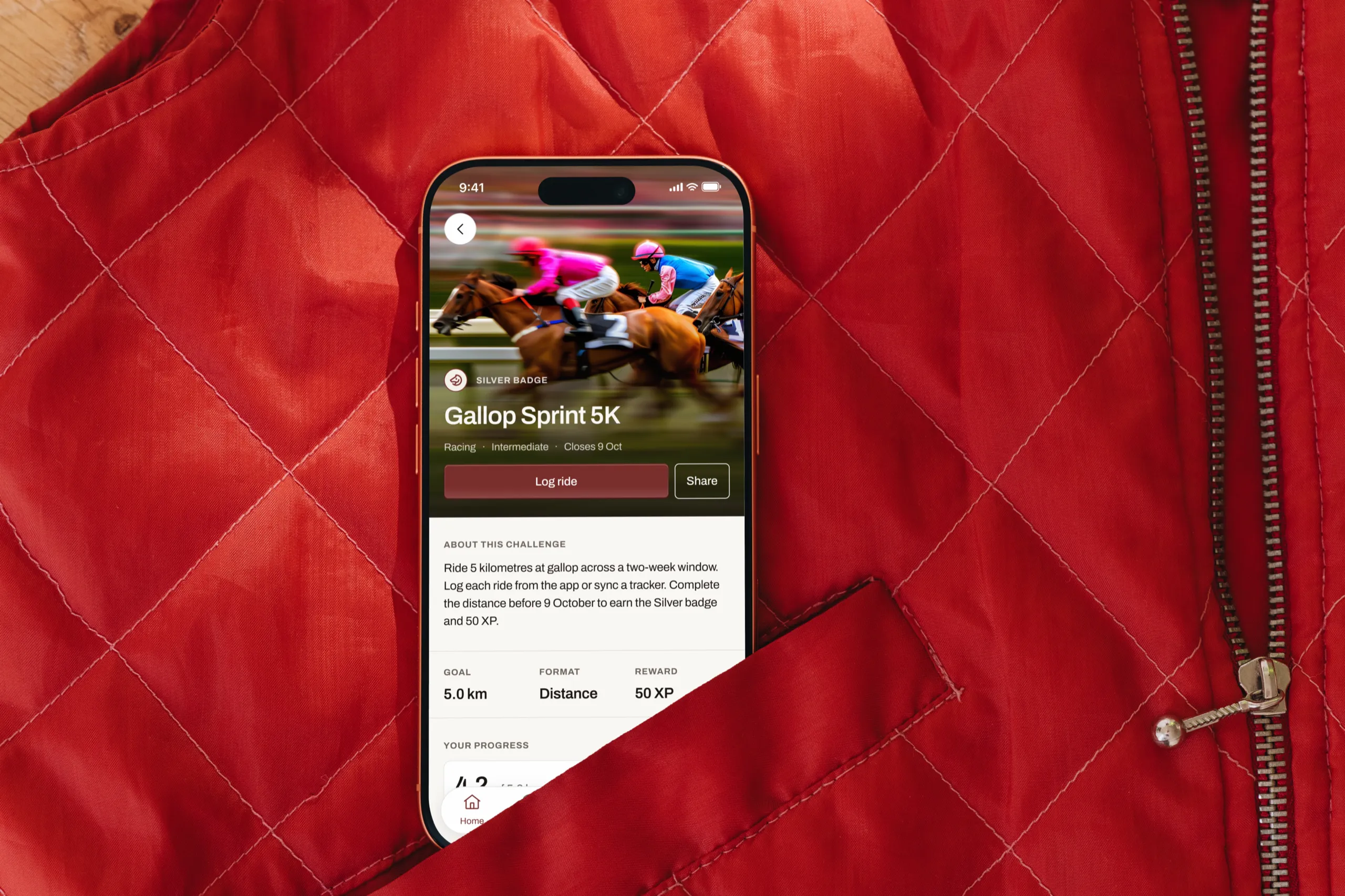
Virtual challenges that get riders back in the saddle.
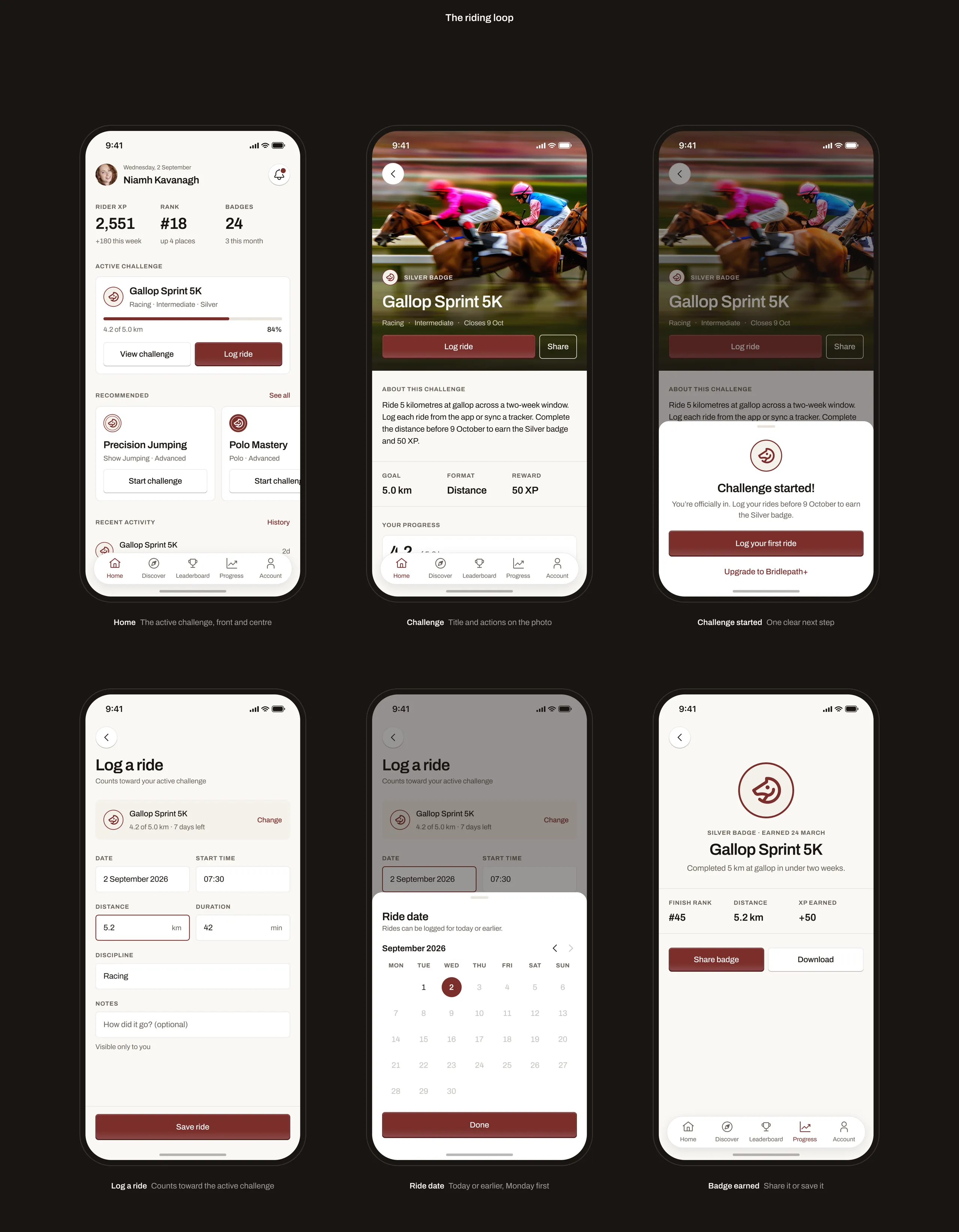
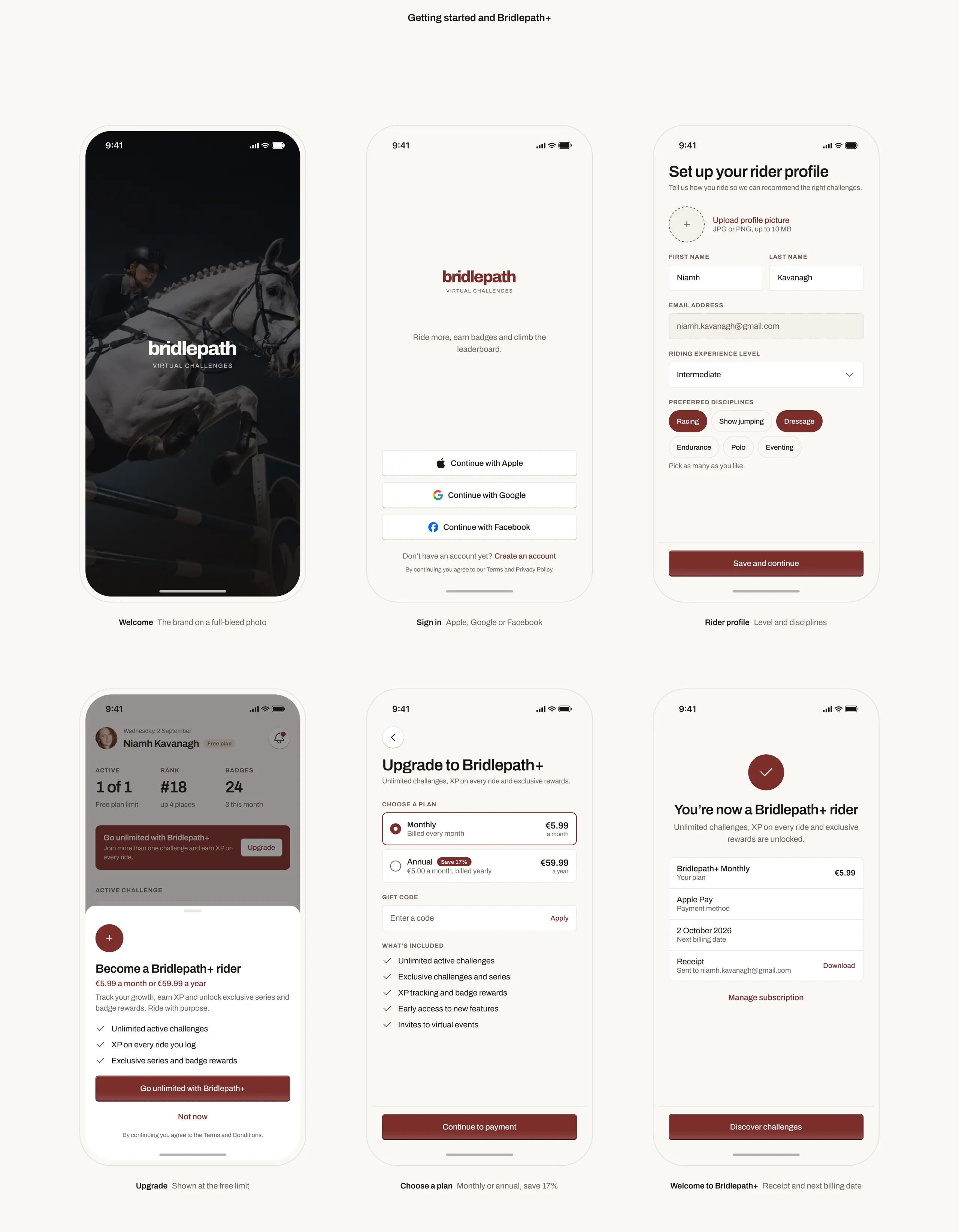
I redesigned Bridlepath end to end: a typographic brand, a token-based component library and all 38 screens of the rider app, from sign-up to subscription. Every flow was rebuilt around one habit: log a ride, see the progress, come back tomorrow.
Riding alone makes progress invisible.
Most riders train on their own, without a coach or a club calendar. Goals slip, a good week looks like a bad one, and the old app hid its challenges behind menus and a dated brand.
A challenge you can see yourself finishing.
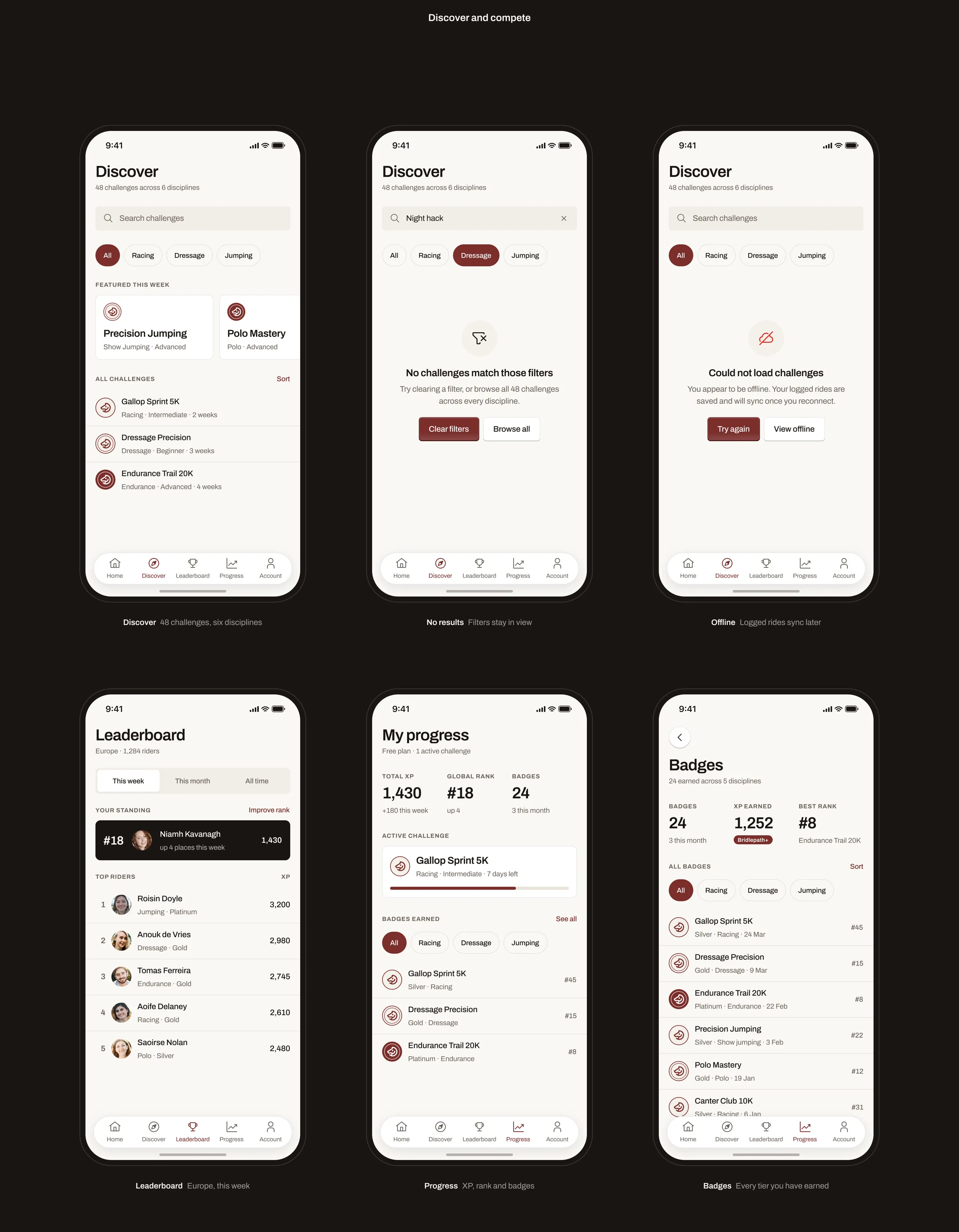
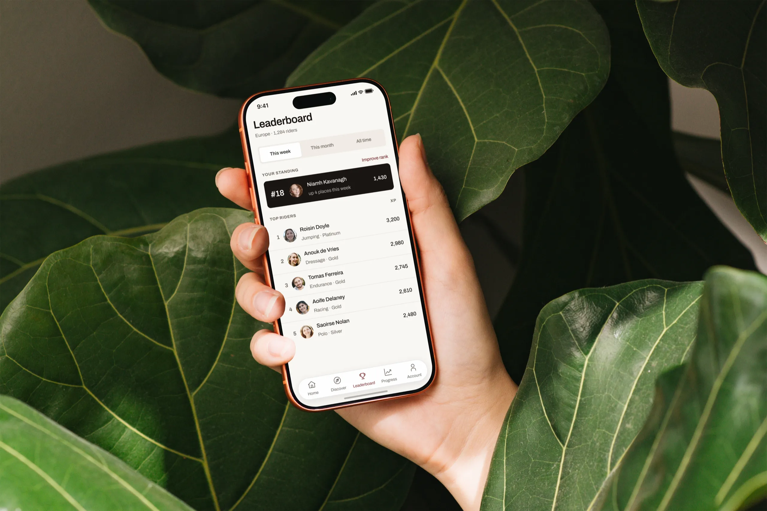
Every screen answers one question: what should I ride next? An active challenge with a progress bar, one-tap ride logging, badges worth sharing and a European leaderboard. Bridlepath+ unlocks unlimited challenges and XP.
Design process
-
01
Discovery
Rider interviews Audit of the old appStrava and Equilab teardown Challenge mechanics review -
02
Structure
Five-tab navigation Challenge lifecycleFree and Bridlepath+ rules A 38-screen user flow -
03
Design
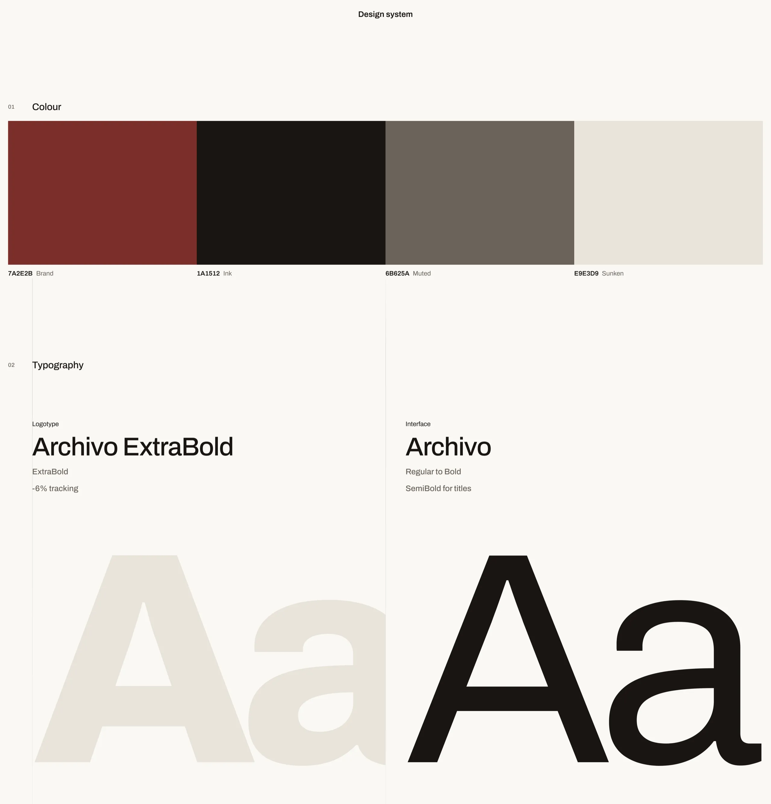
Typographic brand Tokens and componentsEmpty, loading and error states European copy and formats -
04
Handoff
Clickable prototype Dev Mode specsAccessibility pass Stock photography and icons


Bridlepath
Virtual challenges that get riders back in the saddle.
I redesigned Bridlepath end to end: a typographic brand, a token-based component library and all 38 screens of the rider app, from sign-up to subscription. Every flow was rebuilt around one habit: log a ride, see the progress, come back tomorrow.
Riding alone makes progress invisible.
Most riders train on their own, without a coach or a club calendar. Goals slip, a good week looks like a bad one, and the old app hid its challenges behind menus and a dated brand.
A challenge you can see yourself finishing.
Every screen answers one question: what should I ride next? An active challenge with a progress bar, one-tap ride logging, badges worth sharing and a European leaderboard. Bridlepath+ unlocks unlimited challenges and XP.
Design process
-
01
Discovery
- Rider interviews
- Audit of the old app
- Strava and Equilab teardown
- Challenge mechanics review
-
02
Structure
- Five-tab navigation
- Challenge lifecycle
- Free and Bridlepath+ rules
- A 38-screen user flow
-
03
Design
- Typographic brand
- Tokens and components
- Empty, loading and error states
- European copy and formats
-
04
Handoff
- Clickable prototype
- Dev Mode specs
- Accessibility pass
- Stock photography and icons